
 24 september 2025, 12:33
About 64% of email opens happen on mobile devices. That’s nearly two-thirds of email recipients. If you are not optimizing for smaller screens, you’re already missing the best possible results from your campaigns and losing revenue.
However, mobile email marketing isn’t just about making emails look good on smartphones. It’s an essential step in increasing your open rates and conversions.
This guide shows you exactly how to create mobile-first campaigns that drive engagement. We’ll share effective strategies, examples, and best practices for success.
Why is Mobile Essential for Email Marketing?
Optimizing email for mobile devices guarantees your audience a great experience when viewing your messages. It ensures that fonts, buttons, images, and other content display correctly on mobile.
With the ever increasing number of smartphone users, you risk losing the opens and clicks that bring revenue when you neglect mobile optimization.
Here’s why mobile-optimized email marketing is non-negotiable today:
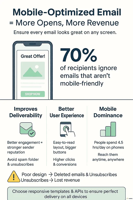
Improves deliverability
The more people engage with your email, the better your sender reputation, which in turn increases your chances to land in their inboxes. When your content looks strange on mobile, it leaves a bad impression.
Surveys show that up to 70% of recipients will ignore an email that is not optimized for mobile. The user might delete your message, unsubscribe, or go as far as marking you as spam. Just one poorly designed campaign could send your future emails straight to the spam folder.
Better user experience
Emails that don’t display well on mobile frustrate users and hurt engagement and conversion rates. Over time, this can damage how your audience perceives your brand. A mobile-optimized email delivers a better user experience and reader satisfaction.
Choosing email solutions that ensure proper delivery across devices shows customers that you are thoughtful and user-centric. Luckily, email service providers (ESPs) like UniOne offer responsive templates that look great on smaller screens. By integrating an API for email marketing, you can use mobile-optimized templates consistently, reducing the risk of display issues.
Mobile dominance
An average person spends around 4.5 hours daily on their phone. Your emails can reach subscribers during commutes, lunch breaks, and moments when desktop access isn’t available. Mobile app email marketing ensures your message meets subscribers wherever they are. An email that isn’t optimized for mobile is a missed opportunity.
What Percentage of Emails are Opened on Mobile Devices?
Email consumption has shifted toward mobile over the past decade.
In 2012, Business Insider reported that mobile accounted for 36.01% of email opens, a jump from 27.39% in the previous year. By 2018, nearly half of email recipients were opening messages on mobile devices. This number continues to rise as smartphones become central to our daily communication.
Current data shows that up to 60% of all emails are opened on mobile devices. Another industry survey shows that up to 71.5% of consumers view email on mobile. These figures vary based on factors like industry and target audience.
Regardless of the exact percentages, this trend highlights the importance of mobile-optimized email design. If your email strategies don’t consider smartphone users, there’s a high chance the people you’re trying to reach won’t open your messages.
Technical considerations for mobile devices
To create a mobile-optimized email, it’s important to consider how various devices will render your content. iPhones and Android devices handle emails slightly differently in terms of display.
iPhones (Apple Mail vs Gmail App)
Apple Mail on iPhone 14 is more generous with character display limits. It displays up to 48 characters for subject lines and 99 characters for preheader text.
Gmail App (on the same iPhone) displays fewer characters – up to 37 for subject lines and 39 for preheader text.
Android (Gmail App)
The Gmail App on a Google Pixel 7 shows less text than the iPhone. The maximum display length for a subject line is 33 characters, while a preheader text is 37.
Samsung S22 Ultra gives you up to 36 characters for subject lines and 40 characters for preheader text.
As mobile technology evolves, so does the display for each device. To ensure your emails look great no matter the device, here’s what to keep in mind:
- Use responsive templates with layouts that adapt to different screen widths;
- Stick to mobile-friendly font sizes;
- Use large, touch-friendly buttons;
- Test your emails on both iOS and Android devices to catch layout issues early.
We’ll look at these elements in more detail in the next sections.
How to Optimize Email Templates and Design for Mobile Screens
Mobile email marketing involves diverse elements that ensure your content is readable across screen sizes. Here are actions you can take to prioritize email marketing for mobile devices:
Go for single-column layouts
A single-column layout is easier to create and adapts well to different screen sizes. It improves readability, reducing the need for recipients to scroll sideways.
Compared to multi-column layouts, a single-column layout also ensures a clearer hierarchy. It helps readers view information in a sequential flow, and the content will scale nicely on any mobile device.
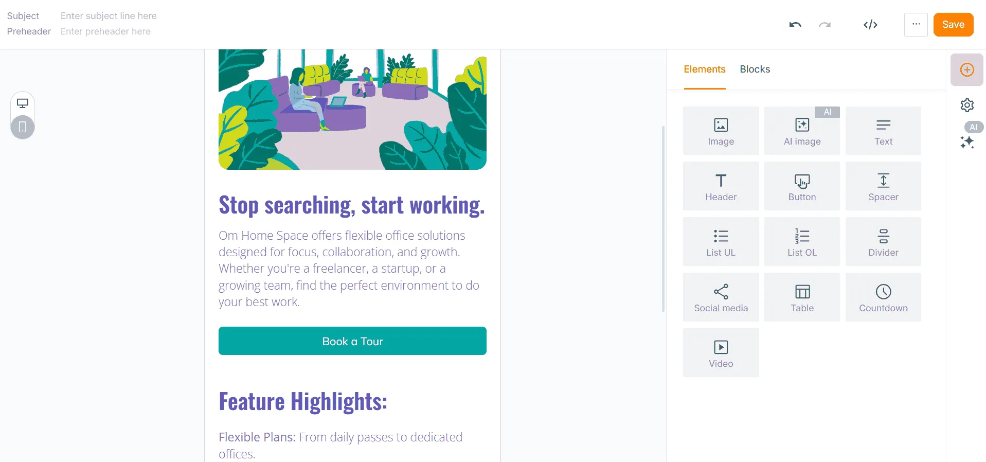
Your team can either code the email from scratch or use mobile-friendly templates. Here’s a very basic example of UniOne’s email builder. All the templates are responsive and look great across devices.
Use larger fonts
One small step that makes a huge difference is using larger font sizes. It increases readability and engagement. While smaller fonts work on desktops, they may look illegible on smartphones. Ideally, the font size of your texts should be at least 16px.

Source: ReallyGoodEmails
Touch-friendly CTAs
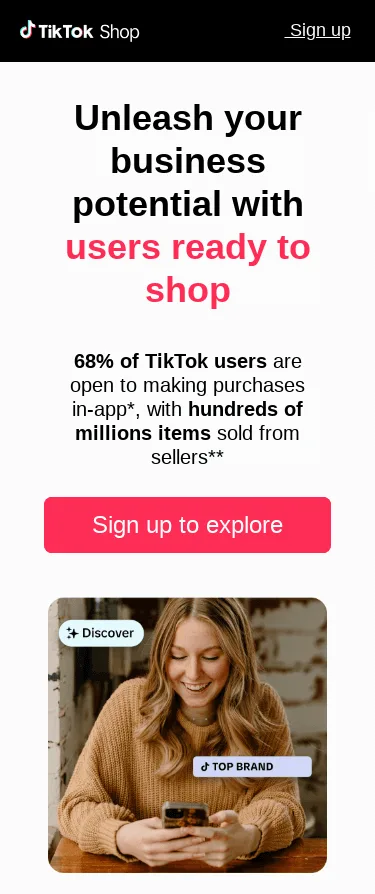
Buttons that are hard to tap will frustrate your customers and discourage them from taking the intended action. Use large buttons that are visible and clickable. Touch-friendly CTAs are at least 44 x 44 pixels in size. This improves your conversion rates by reducing errors and ensuring users complete the desired step.
Source: ReallyGoodEmails
Keep the text concise
Receiving a large amount of text can be discouraging, particularly on mobile devices. People typically spend an average of 10 seconds on each brand email they receive. You have a short window to make an impression while you have the reader’s attention. One way to do this is to keep your copy simple and straight to the point. Write like you are explaining something to a friend who has an urgent meeting to attend.
Optimize images
Compress your image files to improve loading time. Elements like GIFs, animations, and photos can impact the time it takes for your content to load. Yet, when shrinking images, remember to do so without sacrificing quality.
How to Balance Images and Text for Mobile Viewing
An essential part of email marketing mobile optimization is finding the right balance between visual and written content. While images make your emails more engaging, it’s important to consider how they perform on smaller screens.
- Use responsive layout and compressed formats so your images load quickly and scale properly across devices.
- Avoid placing important text inside images. If the image fails to load, the email should still make sense.
- Limit excessive visuals that can slow load times or increase data usage.
Overall, prioritize scannable, concise text while using images strategically to support (not replace) your message. Always include descriptive alt text to improve accessibility and user experience.
Best Practices for Subject Lines, Preheader Text, and Sender Names
Subject line, preheader text, and sender names are among the most important elements in any email you send. They determine whether your message gets opened or is quietly ignored in a crowded inbox. Here are mobile email marketing best practices to increase your open rate.
Optimize the sender names
The sender name is a prominent part of your mobile email marketing outreach. A common practice is to use your brand name and a personal name like “Sophie at/from {Company Name}”. To build trust and recognition over time, avoid changing sender names frequently.
Shorten your subject lines
You have a much smaller space to make an impression on mobile compared to desktop. To make sure your copy works on both, your best bet is to keep it short and catchy. Most mobile devices will cut off subject lines over 30 characters.
Here are two different subject lines on a desktop:
 And here’s how they look on mobile. See the difference? The first one isn’t optimized for smartphones!

Use effective preheader texts
A compelling preheader text summarizes the value of your email to recipients and encourages them to open it. You have more room here to grab attention than in subject lines. For a mobile-optimized email, the ideal length is 50 characters. However, many devices will only show around 40 characters, so it’s best to keep your important message within this count.
How to Test Emails Across Different Mobile Devices and Clients
For effective mobile and email marketing, test your campaigns across devices and email clients. You may feel your content is top-notch, only to find out you need more white space.
A message may render perfectly on an iPhone using Apple Mail but display poorly on an Android device with Gmail. When in doubt, send the email to your team first to see how your content displays across various devices. You can also use email preview tools to save time and effort.
Further, consider implementing A/B email testing to improve your campaign results. This lets you test different subject lines, preheader texts, layouts, or CTAs to see what performs best with your audience. Use the winning email to get better engagement and higher ions.
Examples of Successful Mobile Email Marketing Campaigns
Learning from strong examples provides helpful insight into working strategies and can spark inspiration for your next campaign. Below are some top mobile email marketing campaigns and what makes them effective.
Calendly: welcome email
Source: ReallyGoodEmails
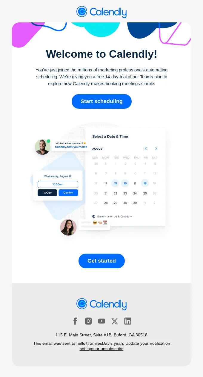
This email keeps things focused on conversion with a clear value proposition – a 14-day trial. Placing the offer front and center ensures users immediately know what’s in it for them.
The single-column layout guides the reader from the headline to the supporting text and down to the call-to-action button.
The CTAs are large, touch-friendly, and hard to miss, which reduces friction for users who are ready to get started.
Grammarly: milestone email
Source: ReallyGoodEmails
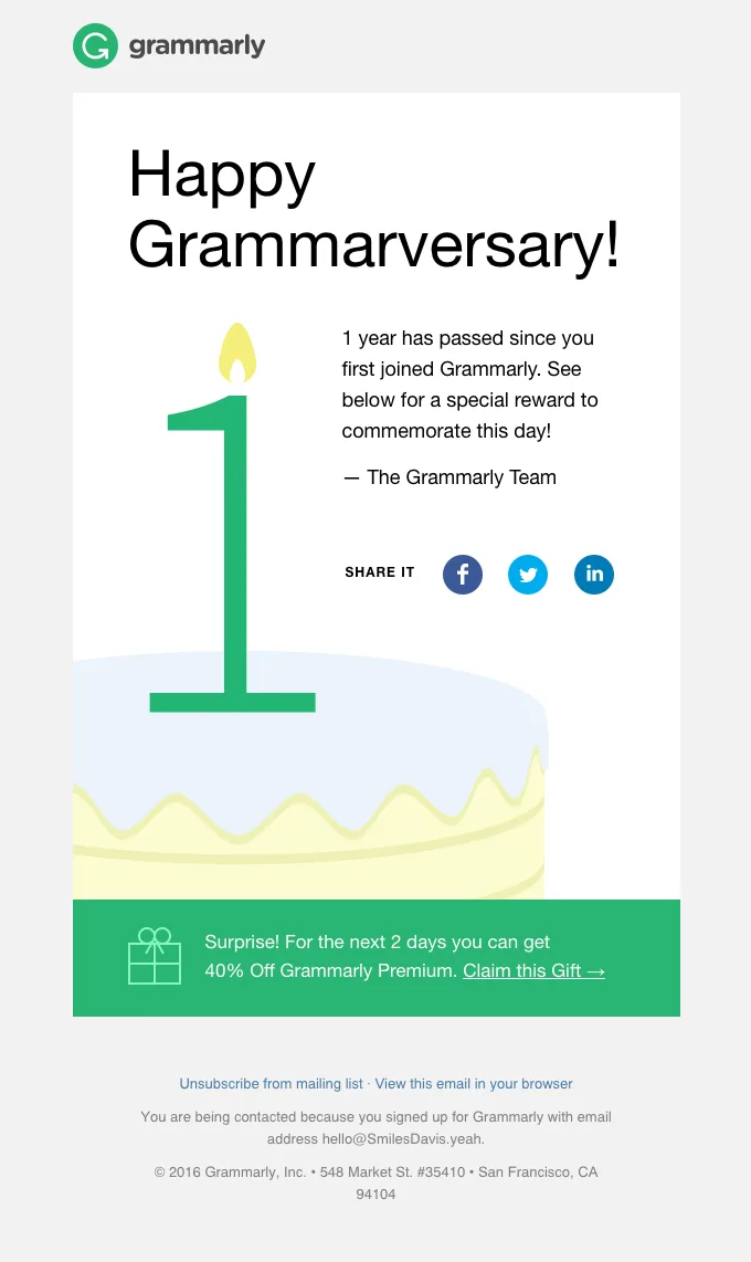
Grammarly shows how to make milestone emails both fun and promotional.
The large candle illustration reinforces the one-year theme without overwhelming the text. Also, the copy is short and scannable, ensuring users quickly understand why they’re being emailed.
A bold offer sits at the bottom: 40% off Grammarly Premium, available for just two days. This rewards loyalty and also creates urgency to act.
The social sharing buttons invite users to spread their milestone, turning a personal achievement into brand exposure.
Spotify: mood-based playlist campaign
Source: ReallyGoodEmails
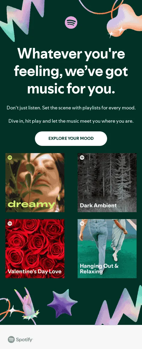
Spotify nails mobile email marketing with this clean, engaging design. The email grabs attention with a bold headline: “Whatever you’re feeling, we’ve got music for you.”
Its simple layout places important information at the top with large font sizes. The touch-friendly button makes it easy for users to take action.
Instead of overwhelming users with long text, Spotify relies on vibrant imagery and short playlist titles such as Dreamy or Dark Ambient.
Note that while text is placed on these images, it serves more as context rather than carrying the core message. With ample text outside the images, there’ll be no confusion if visuals don’t load.
Conclusion
With up to 70% of recipients deleting emails that aren’t mobile-friendly, it’s quite obvious why every business needs an email marketing mobile strategy.
From single-column layouts and responsive templates to touch-friendly buttons, every design decision counts. Short subject lines, compelling preheader text, and recognizable sender names improve your open rates. Once your email is opened, clear hierarchy, scannable content, and fast load times will help keep readers glued.
Customers want your email marketing optimized for mobile. In return, you will notice higher engagement and conversion rates.
The best part is you don’t have to start from scratch. With tools like UniOne, you get access to mobile-friendly email templates you can customize to your needs.
Related Services
UniOne provides a range of features for mobile email marketing, from campaign design to analytics:
Transactional email templates: Use pre-built professional templates to send mobile-friendly emails without coding.
Email integrations: Easily connect with your existing apps, CRMs, and marketing platforms.
Email analytics: This reporting tool shows how people interact with your emails, including open rates, bounces, and click-throughs.
Email automation software: Deliver campaigns, welcome emails, and promotions based on pre-defined actions.
Email testing: Test email deliverability and detect issues in real time.
FAQs
What size should call-to-action buttons be for mobile users?
CTA buttons should be at least 44×44 pixels. They should also have enough spacing around to avoid accidental misclicks.
How to create responsive email designs that work on any device?
Use single-column layouts, scalable images, large fonts, and touch-friendly CTAs. Test across multiple devices and email clients.
What are the most common mistakes to avoid in mobile email marketing?
Avoid a desktop-first design approach, stuffing emails with text, and non-scalable elements. Ignoring loading speeds is another common issue that hurts performance.