
 20 october 2021, 16:25
 1370
1370
Designing an email with the perfect layout on mobile devices and captivating content is more important than ever. Despite the popularity of chat apps and mobile messengers, email remains an important part of our lives. According to the Statista Research Department, global email users reached four billion in 2020 and are expected to reach 4.6 billion by 2025.
Your design must be on point to ensure that your emails stand out and capture your audience's attention. In this guide, we'll discuss email design, go over best practices, and provide some examples of successful designs.
Why Email Marketing & Great Email Design Is Important?
Email marketing has great potential, but not without competition. With over 70% of companies using email newsletters to communicate with customers, it's more important than ever that your emails stand out.
While your email's subject line catches the reader's attention, it's a well-designed newsletter that will help keep them reading further. If they like what they see, they'll most likely return over and over again. Your email design is also a chance to show off your company's character and value. Unlike a social media post, you've got plenty of room to experiment with things like typography, colors, and graphics.
However, deliverability and readability should also be your top priorities. Overloading your newsletters with graphics or large images is often a one-way ticket to the recipient's spam mail folder. You also want to make sure your email design allows readers to skim through the important points quickly.
The Three Main Types of Email Design
Each email campaign needs a unique design. For example, a personal letter from the CEO needs plain text. But if you're promoting your best-selling products, you'll need rich HTML.
Let's analyze the three common types of email designs and see which one best fits your strategy.
- Plain Text;
- Rich HTML;
- Interactive;
Plain Text
Plain text emails have a simple format and are often used in personal correspondence. They often contain only vital information and are very simple to create.
On the downside, plain text emails lack a wow factor. There are no impressive hero areas or interactive features to set it apart from the competition. It's just a simple, dull digital sheet of paper with text on it.
Rich HTML
Rich HTML email design resembles a mini landing page with a unique structure, images, coloring, beautiful typography, and other attributes. They include a lot of information, including animated gifs and videos. Rich HTML can also be responsive and mobile-friendly.
Unfortunately, these emails can be distorted depending on the reader's screen size. You can avoid this by sticking to fully responsive and mobile-friendly templates. Use CSS and HTML structures compatible with various devices, email readers, operating systems, and monitors.
Interactive Email Designs
Interactive email layouts are relatively new to the market. It involves using JavaScript-based interactive elements. However, a vast majority of email clients do not support JavaScript. So only a small portion of the market will be able to benefit from it.
Key Features of an Email Layout
A good email design consists of several key elements that play an important role. Let's take a closer look at them.
1. Copy
Email copy is a pre-written text that is tailored to a particular marketing or sales objective. For example, an email informing your subscribers of an upcoming sale. When writing your copy, here are some best practices:
- Keep your text to a minimum. Break down large blocks into smaller pieces.
- Use different levels of headings.
- Maintain a consistent alignment. Headings should be aligned in the center, but the text should be aligned to the left.
- Avoid using decorative typefaces for large blocks of text.
2. Structure
A well-thought-out structure provides a solid foundation for all your marketing tricks. Your email design will fail if you don't have it.
Consider the following ideas:
- Users expect to see mini landing pages in their inboxes. So you must organize and structure your content. At the very least, the header, central section, and footer should all be visible.
- Include your brand ID, a link to the browser version, and a menu in the header.
- Place contact information in the footer, including address, phone number, useful links, and social media icons. It's also where you'll want to include an unsubscribe option.
- Maintain a one-column design to make scanning information much easier for readers.
- If you're unsure, stick to a 600px layout. Add gaps on the sides to unobtrusively prioritize content.
- To make the reading flow smooth, alternate textual and visual information.
- Ensure that the amount of white space used contributes to the harmony and balance of text and visuals.
3. Headings
Headings help caption a block of text and provide a brief description. But do not overcomplicate its design: the simpler, the better. Headings create visual focal points that people who scan or skim can quickly get.
4. Links
Links should be just that: links. You can experiment with brand color options if the default blue convention does not suit your color scheme.
Make sure they aren't overly decorative or redundant. Links should stand out from the rest of the text and be easy to click.
5. Call-to-action Buttons
Call-to-action buttons are among the most important elements in email design because they're the keys that open doors to landing pages.
The button's text should include action words to set the tone and explain what you want users to do. Use generic phrases sparingly. Make the button specific for people to understand what it's for. It should be a natural extension of the offer and the story's logical conclusion. Personalize your CTA to appeal to a specific recipient or subscriber segment.
6. Visuals
Most email design teams use all the tools at their disposal, including images, illustrations, patterns, textures, icons, animated gifs, and even emojis. Visuals help engage your audience, retains the user's attention, and also make an impression.
Just remember to use optimized high-resolution photos that will look great on any device. To add a personal touch, create custom images and iconography.
7. Color
You can apply color psychology to email design. Depending on the customer's gender and age, current situation, tone, and brand value, you may benefit from one or more color palettes.
Pink, for example, is ideal for female customers, whereas blue is ideal for startups and small businesses. Green, blue, red, and yellow can be used for action-oriented elements to drive conversions.
In addition, the type of campaign you're running may influence your color choice. Email designs should reflect holidays and seasons. Black Friday newsletters, for example, have a black core, while Christmas newsletters have green, red, and white.
8. Typography
The most important reason to focus on typography in email design is that it impacts user experience and readability. Families of fonts have hidden meanings and convey a wide range of emotions. Serif fonts, for example, appear more elegant and sophisticated, whereas sans serif fonts appear more casual and rustic.
Here are some tips for choosing your typeface:
- For long texts, use sans serif fonts.
- For headings, use custom fonts.
- Avoid using typefaces that are too ornate except in headers where the font size makes each character legible.
- Use the appropriate size. The standard practice is to use a 14-16px font for body copy and a 20-30px font for headings.
- Use the proper amount of space between lines. It should be 1.5 times larger than the font size.
- Use the appropriate amount of space between characters to ensure that each symbol appears legible at first glance.
- Use one font for headlines and another for text.
Tips for Creating Beautiful Emails
Are you ready to start creating your email designs? Check out our helpful hints to keep you on the right track.
1. Experiment With the Color Palette
Colors are important: they give your newsletter a personality, theme, and branding perspective. Colors have a subconscious effect on people and tend to invoke certain emotions. Our brains process visual information 60,000 times faster than text, and color plays a big role in processing what we see. In one case study, simply changing an email's call-to-action button from green to red led to a 20% increase in conversions.
Here are some unique ways to use color in your newsletters:
- Use Split color blocking to divide content;
- Replace shades of grey with blue;
- Organize content with color tabs;
- Add color to grids;
- Create contrasting CTA buttons;
- Use your brand's color for links;
- Use one background color for headers, footers, and ads.
2. Use More Animations
Animation can help you make your brand stand out in emails. It allows you to catch the reader's eye, emphasize a promo or message, and boost email conversion rates.
However, animation in emails requires the ideal design to ensure compatibility with various levels of support across inbox providers. So using animated GIFs is the most reliable way to confirm your email renders well across most email clients.
Animated email design often features a fun and creative GIF that conveys a single, clear message in a unique, surprising, and memorable way. But the message has to be delivered to customers perfectly, encouraging them to follow up on your offer. You can use animation to highlight text, showcase different products, and even bring photos to life.
Here are some tips for using animations in an email:
- We recommend that any GIFs in your email be under 2.5 MB to ensure a good user experience and deliverability.
- Make sure that all vital information is in the GIF's first frame.
- Avoid animating key promotional text (e.g., 50% OFF).
- When exporting the animation, make sure it loops.
- If you're adding a CTA to your GIF, be sure the design supports your linking strategy. Animation is powerful, but you shouldn't use it at the cost of creating shoppable emails.
3. Separate Information With Color Blocking
Email newsletters are an excellent way to generate buzz and drive sales for new products — but you must be creative. Instead of including a product photo in their email, Tiffany & Co. incorporated their Tiffany Celebration rings directly into the design.
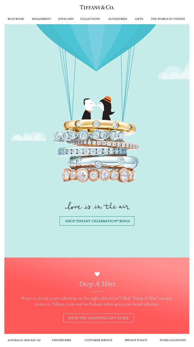
In addition, the color blocking style allows the product to take center stage, and it also creates a clear separation of messaging within the email. The blue section is about directly shopping for rings, and the red section is about "dropping a hint." Letting your loved one know which ring would make the perfect Valentine's Day gift.
Separating different messages, images, and sections of your newsletter with color blocking is a great way to generate buzz.
4. Keep It Simple
Minimalism is all about removing unnecessary elements to achieve simplicity, functionality, and elegance. It promotes the most essential points and eliminates anything that distracts readers.
You can free up space for readers to take in more information by using a minimalist concept in your transactional email template. Create and design on-point offers with fewer things to read, increasing the chances of conversion.
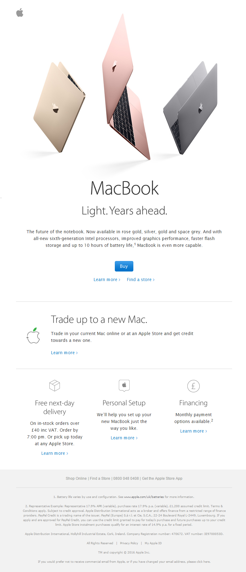
Apple's email design makes extensive use of white space and places a strong emphasis on the product. The product is attractively presented, with pops of color to add interest. The information is well-aligned with a vertical hierarchy for easy skimming. Readers can tell what's important because of the different text sizes and grayscale colors. This design is simple, with minimal elements and a straightforward structure.
5. Make It Recognizable
Humans are pattern-seeking animals, and it is precisely this need for pattern recognition that lays the groundwork for strong brand recognition.
It's critical to remember the following:
- The fonts, colors, call to action, and layout must be consistent with your company's branding.
- Use your logo and display some information about the company prominently.
- Sign the email with a personal signature or the company name.
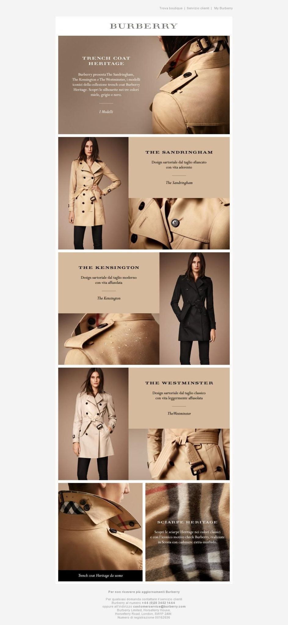
For example, Burberry's email design is a fantastic visual solution for showcasing its iconic trench coat and reinforcing brand awareness. The tan color palette and various shots of the signature coat help the design achieve instant recognition. The typefaces are simple and clear, and the grid ensures that the reader can easily follow the visual story. Overall, the design is straightforward, streamlined, and easily recognizable.
6. Avoid Using Too Much Text
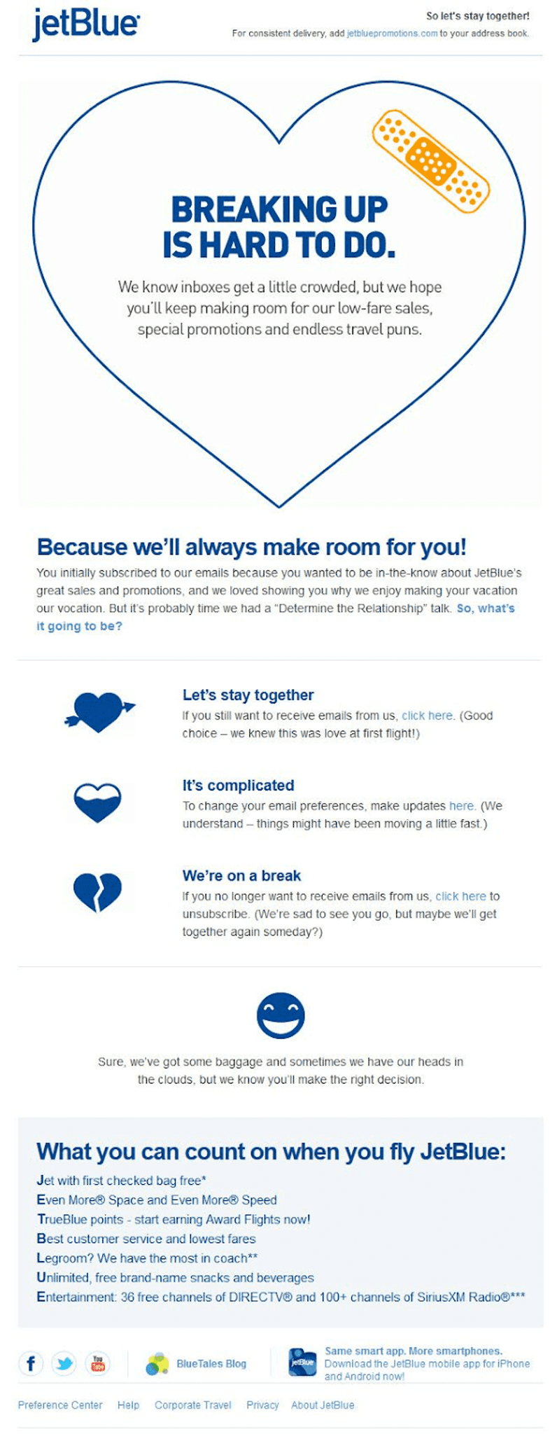
Too much text can lead to too much visual clutter, leading to a drop in newsletter conversions. JetBlue uses graphic icons, headers, lines, and shapes (like the box at the bottom of the page) to break up large blocks of text and proper spacing and balance. This approach allows them to convey all of their messages to their audience without visually overwhelming them.
7. Always Start With Your Branding
When your readers open your email, it's crucial that they immediately recognize it came from you. They'll know what to expect from your newsletters this way. While they can always look at the sender's name, starting your newsletter with a branded header with your colors and logo is far more effective.
8. Pay Attention to Hierarchy
Your email's visual structure is vital when it comes to boosting your click-through rate and limiting unsubscribes. Your readers must understand its purpose and how it applies to them right away.
Make this the most visually prominent element on the page to draw the reader's attention to it right away. You can use a banner to do this. You should also make sure that your CTA (call-to-action) is clear and distinct from the rest of your newsletter. It'll compel readers to take the action you want them to take (usually clicking to a web page).
9. Don't Shy Away From Video
Tiktok has proven that video is king in marketing right now, and that includes email newsletters. According to statistics, video increases open rates by 19% and click-through rates by 65%. It's a great way to make your emails stand out in your inbox because it makes them more dynamic and engaging. Plus, videos are a great way to give your emails a more personal touch, especially if they feature you or someone else from your company speaking.
10. Make It Mobile-friendly
More than 70% of people read their emails on their phones using an app. As a result, you must check that your emails are visually appealing on a desktop and mobile-friendly. That means no content is being cut off, all images are loading, and your text is readable. Our email newsletter templates are all mobile-friendly, so you can be confident that your newsletter will look great on any device.
Final Thoughts
Email is here to stay, and now is the time to start incorporating it into your marketing strategy if you haven't already done so. You can create beautiful email designs that anyone would be happy to see in their inbox if you use the tips, tricks, and examples in this guide.