Use these newsletter signup examples to power up your email list building strategy. Get more subscribers with proper mailing list sign-up. Best practices roundup from UniOne.
Here Are the Techniques That Make a Great Newsletter Signup Form
Email subscription is an option on the website that allows visitors to receive the company's newsletters. It is usually represented by a subscription form. This tool is literally a window to any email marketing campaign.
A well-designed and eye-catching signup form increases the number of leads. While it deserves the most prominent place, on many sites the contact collection form is quite hard to find. The user should not have to wander about looking for it. It is important to place the form not only on the main page but also on several others, as a reminder of the opportunity to subscribe to an email newsletter.
Two most important aspects of the subscription form are content and design. Taken seriously, they can help you significantly expand your customer base, encouraging visitors to provide their data. But these two things will not be enough if there’s no good reason for people to subscribe.
Tips for How to Create an Email Popup that Works
Surely you would like to learn how to make an appealing email list sign up form for your website. Here are the best sign up form tips that you can try.
What you probably haven't heard of is that a pop-up form can easily double the growth rate of your mailing list. You may even disregard all other subscription methods, and pop-ups will still skyrocket your email marketing.
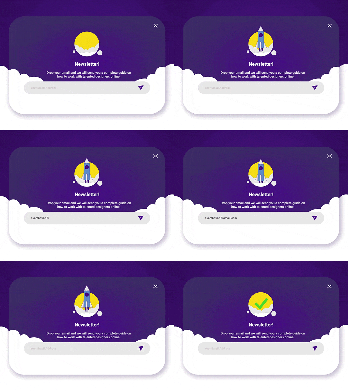
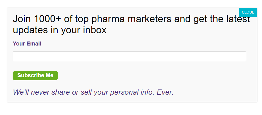
First, you need to decide how many data entry fields your form needs and what kind of fields they will be. With a pop-up, everything is simple — the form can contain one or two fields maximum. You definitely need to ask for an email and a name. The form also needs a specific message ending with a clear call to action: subscribe to the newsletter, get useful information by email, don’t miss our hot sales, etc.
The simpler and shorter you make your proposal, the better. Ideally, it should take less than two seconds to understand what you want — this is the time it takes a visitor to close the annoying popup and return to viewing the page.
If your project is purely informational, then this very basic sign-up form for a newsletter offering fresh articles may be enough. If the site pursues some commercial goals (like an online store), it is advised to offer a certain bonus for the subscription: a discount, some useful information, a minor free service (audit, delivery, etc.)
However, even on a blog or information portal, an offer to share your email in exchange for a selection of exclusive materials will probably work better than just a simple invitation.
Never Stop Experimenting and A/B Testing
Only testing will tell you which color, template, and title of the email list sign up sheet really work best for your customers and increase the number of subscribers. In any case, different properties of the form should be tested.
Collect the test results in a spreadsheet. Be sure to re-evaluate all options in terms of relative increase of incoming traffic, since it may vary from week to week, and it would not be correct to compare absolute values.
To provide reliable data, the traffic on the website should already be sufficiently high. If during the first week of the test you were visited by 100 people, of whom 5 subscribed to your newsletter, and during the second week you have 110, of whom 8 subscribed, this does not mean anything. To get statistically significant results, you’d need hundreds and thousands of visits. If you don't have that much in a week, just increase the testing period.
Six Best Practices to Improve your Email Deliverability Rate
Working on increasing traffic to the website is certainly an effective strategy. But sadly, many first time visitors just leave the pages and never come back. Therefore, it is better if you do not just attract new visitors, but also work on their retention. And an email newsletter is perfectly suitable for such a purpose.
Experiment, test various templates and call-to-actions, change their location and design. The information obtained as a result of your experiments can be effectively used to increase the number of subscribers, which will undoubtedly benefit your business. So, what exactly could you try?
Leverage Minimalist Design in Email Newsletter Sign Up Forms
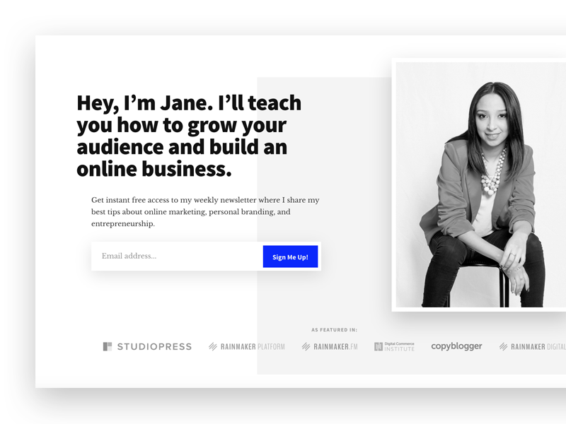
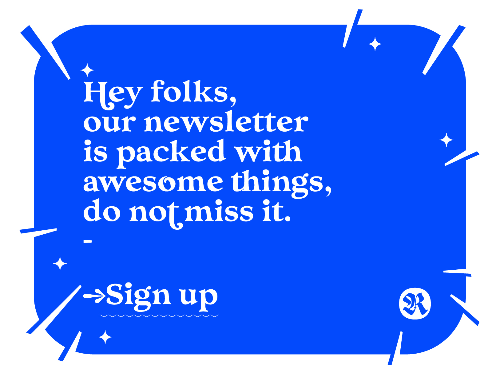
Minimalism is the main trend in modern design, and it also applies to sign-up forms. Minimalism does not imply a poor and meaningless look, rather it is about the minimum of necessary functional elements. Try to limit the number of fonts, colors, and graphics to one or two and focus on the functionality of the email sign-up sheet template, as implemented in the example above.
Provide the Information People Want to Know When Signing Up for a Newsletter
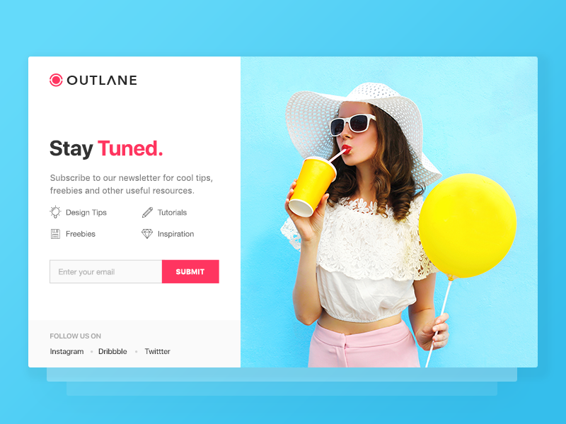
The sign-up form should tell people what exactly they will receive in exchange for their email. You can use visual means to let them know what your newsletter has to offer.
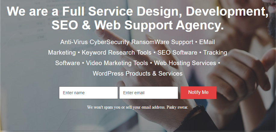
Use catchy images, highlight important information, make the header larger than the rest of the text — the main thing is that it should attract the readers’ attention and be informative. The example above also has a photo on the right, making the registration process feel more personalized and secure.
Give People an Incentive in Your Newsletter Signup
Add a lead magnet, seriously. Offer rewards for subscribing to the newsletter, such as exclusive content or a discount promo code. People always seek benefits for themselves, so why not give them those benefits? For example, during the coronavirus quarantine, lead magnets with anti-crisis tips were quite popular.
Newsletter Signup Form Best Practices Exemplified
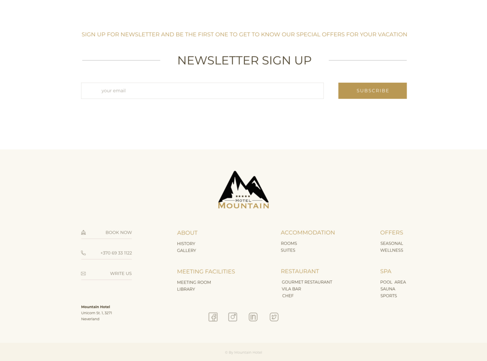
Mailing list sign up forms should not be too large or overloaded with information, even if it seems important to you. Make it simple, add hints or useful links for fields that some people may have difficulties with, like postal code, metro station, etc. You can implement them in the form of a drop-down list for easier entry.
Don't force people to input the same information twice. If the delivery address and the payment address are the same place, you can simply ask to check the box. Remember, the clearer, the better.
Create Your Exclusiveness With Their Newsletter Signup Form
When browsing websites, not everyone is eager to just give away their contact info, so it is important to stimulate the client's subscription. Add some subscription bonuses. For instance, e-books help attract an audience quite well. But try to choose a bonus wisely so that those who register will really be your trustful customers.
Make it clear that subscribers will receive information faster than those who are not subscribed. Specify the newsletter frequency or date of the most recent email, so the person could have an understanding and not worry about spam. In the example above, the company added a little joke to it, and so can you.
Use Social Proof to Compel Users to Sign Up for Your Newsletter
Again, regarding people’s reluctance to sign up for mailing lists, social proof can come in handy. This is a psychological phenomenon when people make decisions based on the opinions and actions of other people.
Here are some examples of social proof that can help increase the number of sign-ups:
- Our newsletter is now read by N people.
- X% of our course graduates have found a job in the first month after graduation — we will tell you how that works.
- 100% of our subscribers have already received gifts. Would you want one too?
Importance of Email Verification When Creating Newsletter Signup Forms
Pop-ups work like a vacuum cleaner for users’ emails, but any additional actions required from them will create an obstacle in the "air flow” that pumps addresses into your database.
Two data entry fields instead of one is an obstacle, two subscription steps instead of one is an obstacle too. As a result, there are fewer addresses at the end of the funnel.
Subscribing with double opt-in surely improves the quality of the email list, but it also has the same drawback as above. It is worth combining two-step validation with an incentive for a subscription (if a gift is expected, there is no point to specify an incorrect address).
In addition to this, the mailing service usually has its own mechanisms for cleaning out incorrect addresses. It is possible that the first campaign sent to freshly collected emails will not have an excellent delivery rate (usually it does not exceed 90-95%), but on the second or third time, it is expected to be about 98-99%. There is always an option to request a confirmation in the welcome email instead of taking the action right on the website.
Rely on email signup form best practices and keep in mind that people have limited time, and are not always willing to share. And last but not least, remember that people love to feel exclusive and get free stuff, even if it’s just a small discount in the sign-up form.

 18 july 2022, 15:44
 429
429
